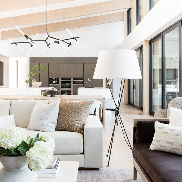
6 Affordable Ways To Refresh Your Space Right Now
As we move into the new year, it’s a perfect time of year to organize and refresh your space. Most of us don’t have deep budgets to pull from, so I’m sharing six super affordable things you can do to update any space in your home right now.
Add a fresh coat of paint
It’s amazing how much paint alone will transform a home. As many of you know, we painted our walls from a greige/taupe color to a creamy white and we still cannot believe the difference. The house looks larger, more open. We used Benjamin Moore Swiss Coffee at 75%—meaning it’s just a bit lighter than the usual formulation. This is a great, neutral cream color that doesn’t look too yellow or too stark. Our home isn’t very large, and we don’t have super high ceilings, so it was important that we figured out ways to brighten the space. We also painted the ceiling the same color as the walls (make sure to use a matte/flat for ceilings) which also helped make the rooms look larger and more expansive. So, whether you are looking for a moodier palette or something to open your space right up, paint is the first go-to step to take.

Check the temperature of your lights
I feel like light temperature isn’t a topic that is often discussed, and it can make a HUUUUGE difference in the way your space looks. What I mean by temperature is the color of your light bulbs, measured in Kelvins. Generally, there are three types: Soft/Warm White (2700K – 3000K), Bright White/Cool White (3500K – 4100K), and Daylight (5000K – 6500K). The higher the Degrees Kelvin, the whiter the color temperature. Most homes default to a Soft White temperature which can look quite yellow. This affects how your paint color looks. How your furniture and things look.
This past year we changed out every single bulb in our home, including can lights and fixtures to a Bright White temperature. I find the sweet spot is about 3000 to 4000K, which is as close as you can get to a neutral white light. It’s not too yellow, not too blue. We also sourced Hue (smart) bulbs for some of our rooms to customize color temperature and set lights on a routine (via an app)—they are super pricey, but worth it for some spaces.


Consider your window treatments
What are you trying to do with your space? Want it to look bigger? Want it to look cozier? Want to focus on bringing natural light in? Keeping your goal in mind, consider your window treatments. If you want your space to look bigger, try raising your curtain rod as high as you can to draw the eye up. Also, you may opt for window treatments the same color as your wall—that monochromatic look can make rooms look bigger. If you’re looking for cozy, consider a soft pattern or warmer tone to your curtains, or maybe layer things up with a shade + curtain combo.

Photo: Amber Interiors
Change out pillows
The easiest thing you can do is switch out your pillows and throws—instant refresh! I try and buy pillows that allow me to switch the cover out while using the same insert, that way storage doesn’t become a problem. Go for a coordinating color palette with pillows in different sizes and textures.
Keep an eye out for cohesion
What makes one space look so polished and another look busy and discordant? It can largely be a cohesion problem. Look around your home, your space, and consider how your furniture, your paint, your accessories all work together. Are you using similar colors that work well together? I’m not talking matchy matchy—you don’t want that, but are you following a thoughtful color palette? Shades of three or four colors with items and furniture pieces that work well together. In our house, we’ve really moved towards a neutral palette: creams, blacks, browns, camels, soft grays. Metals in brass and black/iron. It’s a lens I now use when shopping for anything home décor. It doesn’t mean we don’t have items in colors outside of those mentioned above, but it does mean that the major colors coming through are one of those, and that they do work well together. It helps make a space look put together, intentional.

Photo: Studio McGee

Photo: Studio McGee
Edit, edit, edit
This may be the most important tip on this list. Again, look around and think about the things you see. Which are the pieces you love? Which are functional? Are there other things you can remove that aren’t adding value or function? Are your table tops and spaces full of knick knacks or too many items? Those things may just be adding visual clutter.
Try a 20- to 30-minute room refresh. I have done this for years and still do it. I take one space and as quickly as I can, go through the room, take out stuff we don’t need, organize spaces and shift things around. You would be surprised what you can do in a dedicated 20 minutes. If you have several knick knacks you love, consider creating a dedicated vignette/space where you can bring them all together instead of spreading them out. Editing is such a powerful tool and best of all, it costs nothing!


 by
by