Design Reveal: Powder Bath

Finally! It’s time to remodel our powder bath. It’s the last space downstairs that has been untouched and so happy it’s finally getting some love and attention. The space is not an easy one to plan for. It’s small—really small—and has some hard-to-work-with ceiling angles.


My original plan for the space was to cover it in this gorgeous (expensive) floral wallpaper I love, but since we have textured walls, we’d have to smooth them out first and the process of doing that, plus hiring someone who was especially amazing at wallpaper, was driving up our cost.
So, pivot.
I loved our black shiplap wall, and wondered how I might take the concept and apply it to the bathroom. Slowly the plan came together.
- Vertical, slightly thinner shiplap, 3/4 of the way up the wall to avoid doing anything (but painting) the ceiling angles.
- Moody paint on the shiplap contrasting with white on top including ceiling.
- Polished brass to play off the dark, moody paint.
- Mix of metals to keep things interesting.
- Simple, modern console sink to save space and make a statement.
- Texture to add dimension.
- Modern, one-piece, full-skirted toilet (more on my toilet research soon).
- Warm-but-striking art to make it all come together.
A few weekends ago, I got started and painted the bathroom Benjamin Moore Chantilly Lace (clean, crisp white) and installed the light fixture—a modern brass sconce from West Elm. Then, it took us a couple weeks to decide on paint color for the shiplap. We looked at a million different swatches, all on the moodier, darker side of the spectrum. Final choice was between Benjamin Moore Dark Olive and Kitty Gray and as much as I loved both colors, my husband preferred the deep blue-gray-green Kitty Gray shade. I’m fully on board, there’s something about the interesting, muddy warm depth of the color that I’m loving, especially against the crisp white. Depending on the light, it can look gray, or blue, or even green.

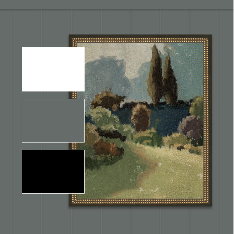
The clean modern design of the console sink with polished brass legs and fixtures will contrast beautifully with the deep color. I’ll bring in some texture with the woven wastebasket, sisal rug, and Turkish linen hand towel. It also took me some time to decide on the art. Originally I wanted a funky, cool portrait, but when I saw the warm tones of the Forested Path art piece from McGee & Co., I knew it was the right choice. There’s some of the same blue grays in the piece, but there are also some of those deep, foresty olive greens I had been longing for. It’s the perfect counterpoint in the space, and hopefully it arrives sooner than it’s 4-week lead time (le sigh).
Anyway, we hope to get started late this week, and so excited to bring you along on the journey!


")

2 Comments:
Leave a Reply
On Instagram


Vilma Iris © Copyright 2024
Designed and Built with  by Priceless Design Studio
Dorothy said:
About the textured walls,
What’s the process for taking off the texture, is there an acid product you apply and scrape? Do you demo it down to the studs and install new wall board?
Thanks
vilmairis Post author said:
Hey there, we actually kept the texture on the walls. You can just add the shiplap on top. If you were to want to do wallpaper, though, you would definitely need to smooth out the texture so the wallpaper comes on smoothly.